Cafe discovery
- Most regulars found Lella by happy accident or by a friend's recommendation. Word of mouth is doing a lot of the work.


Lella Alimentari is a responsive website that gives a beloved Italian eatery in Brooklyn, New York a stronger online presence with a touching story and easy-to-navigate online ordering experiences.
Lella Alimentari is a Brooklyn eatery with two locations and a following built mostly on word of mouth. Ask a regular how they found the space and you'll hear "a friend brought me here" or "I walked past the eatery and felt drawn to the smell of coffee and good vibes". However, none of Lella Alimentari's charm existed online. There was no spotlight on the cafe's story, no incentive to encourage more food & beverage sales, and no quality imagery that won over customers.
The challenge was never to simply "build a café website". It was how to tell the story of Lella Alimentari and make its online order process smoother so that customers would want to repeatedly revisit the space.
“My goals are to create adventures for my customers and to preserve Lella's homey and cozy atmosphere. Lella's policy is to treat everyone like family and to help everyone feel at home.”
Chicco's asks were practical and straightforward – online ordering, a loyalty program, a story on Lella's unique background, and a place to sell merch. As I designed, I kept referring back to the quotation above to ensure that I was helping the client achieve his vision for the business.
To design a website Lella's regulars and first-timers would actually use, I sat down with 9 people at the cafe — from weekly regulars to customers walking in for the first time — and learned what draws them to Lella and what they would love to see on the website.
Two things came up again and again.
Almost everyone wanted the same three things on a cafe's website: the story behind the cafe, a straightforward menu, and a real sense of the space.
Every person I talked to lit up at the idea of a loyalty program. The reward — more than the coffee itself — is what pulls them back through the door. The catch is that paper cards get lost easily.
Besides these two core ideas, there were other customer thoughts worth noting. These patterns also shaped details of the design.


Before sketching wireframes, I looked at four other Williamsburg cafes with strong online presences for ideas — Daytime, Land to Sea, 787 Coffee, and Hungry Ghost Coffee. I created a chart of valuable features mentioned by customers that I interviewed earlier and identified whether or not these cafes had them.
From the table above, it's clear that almost all of the competitors have easy site navigation but most of them do not provide an important online service that many of the customers I interviewed mentioned was important to them – a clear online ordering path. I saw three opportunities where Lella can learn from what's already working well in the market and ways that it can stand out.
This drives more sales and helps customers order ahead of time to skip lines when they arrive, something none of the other cafes provided.
3 of 4 case lead with heritage – Chinese American, Puerto Rican, and Turkish.
This directly addresses the need that all my customer interviewees brought up – the ability to accumulate points in exchange for rewards to keep them coming back.
After synthesizing data from my user interviews and competitor analysis, I uncovered two kinds of customers at Lella. A regular customer who wants a smoother way to order her food. The other wants to leisurely enjoy the cafe's ambience as a first-time customer. Same cafe, same website, two different jobs to do.

The Explorer
"I love to try new places and learn about their stories."
Taylor is a cafe lover who discovered Lella by chance and was drawn by glowing reviews of its piadine. He values high quality service and store perks, which turn his occasional visits into regular visits.

Loyal customer
"Looking for a way to seamlessly order food. Digital loyalty programs are a plus!"
Beatrice is a 9–5 office worker who lives five minutes away from Lella Alimentari. She regularly tries to get quick takeouts but finds herself often stuck in long lines with no way to plan around it.
These two user personas want to achieve different things on Lella's website — one wants to be pulled into the cafe's story as a new customer and the other wants to jump straight to ordering as a regular customer. The website has to offer both paths immediately without making either of them dig.
After experimenting with several layouts of the website, I built Lella Alimentari's design system to establish a set of rules that would help me standardize my user interface creation process and enhance visual consistency. These resusable elements were critical in speeding up my process of crafting the webpages. I wanted the design system to convey Lella Alimentari's core personality – playfulness and warmth.
.png)
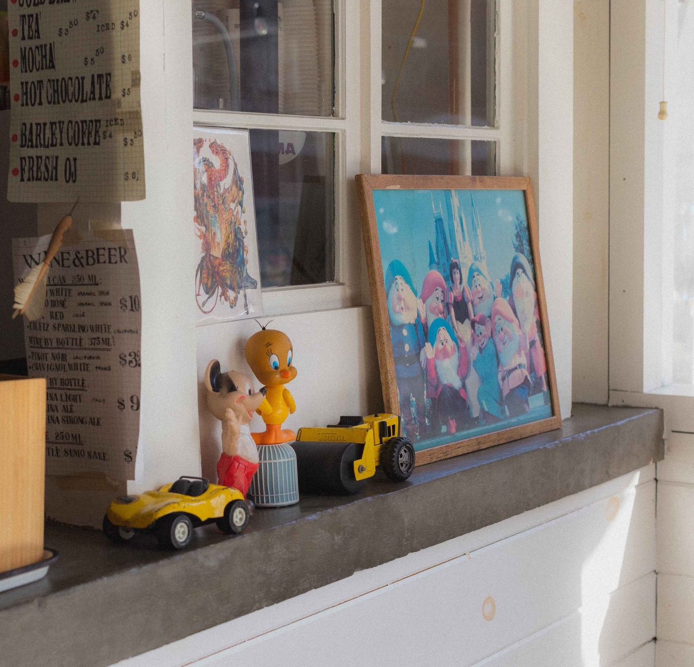
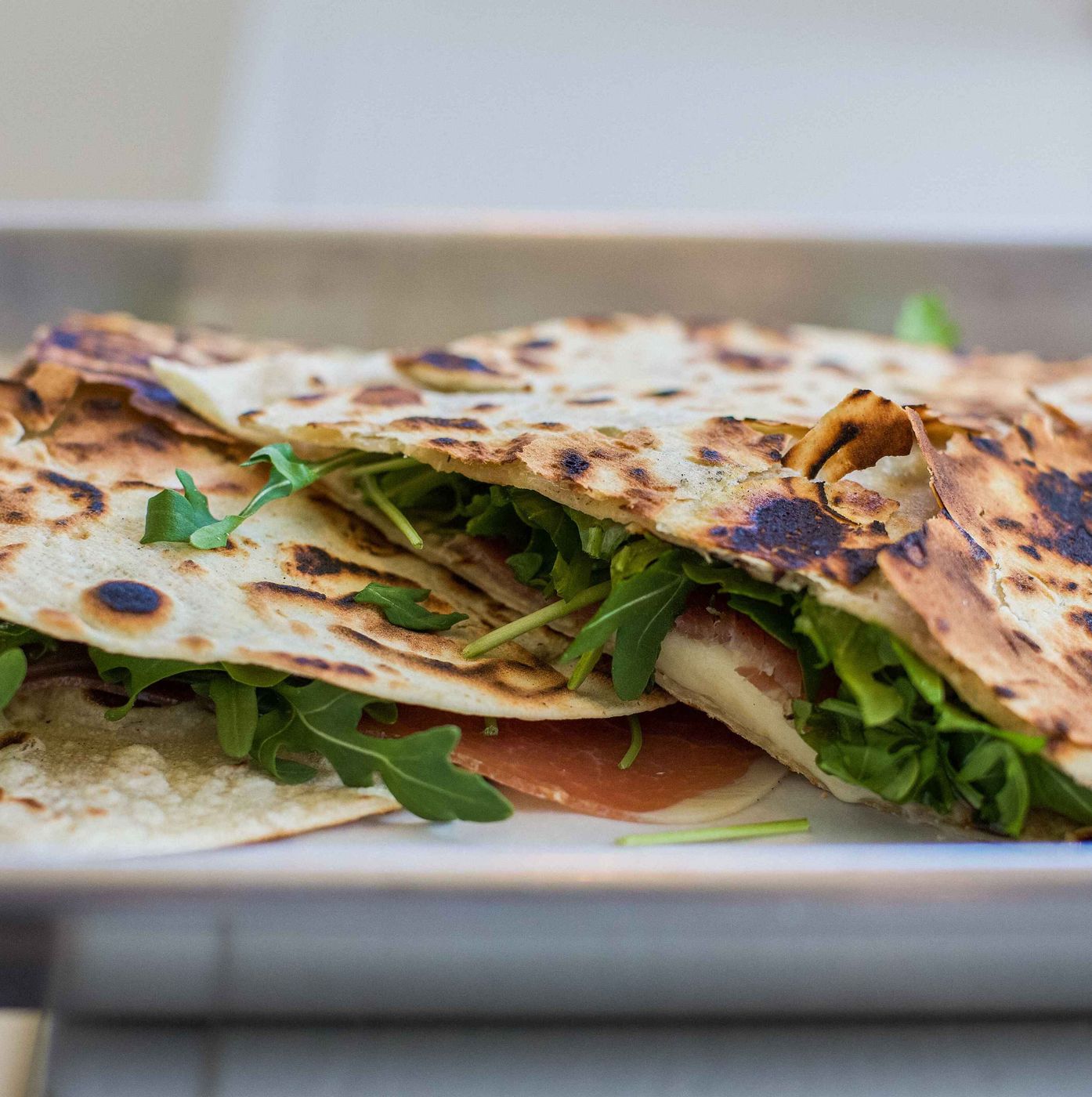
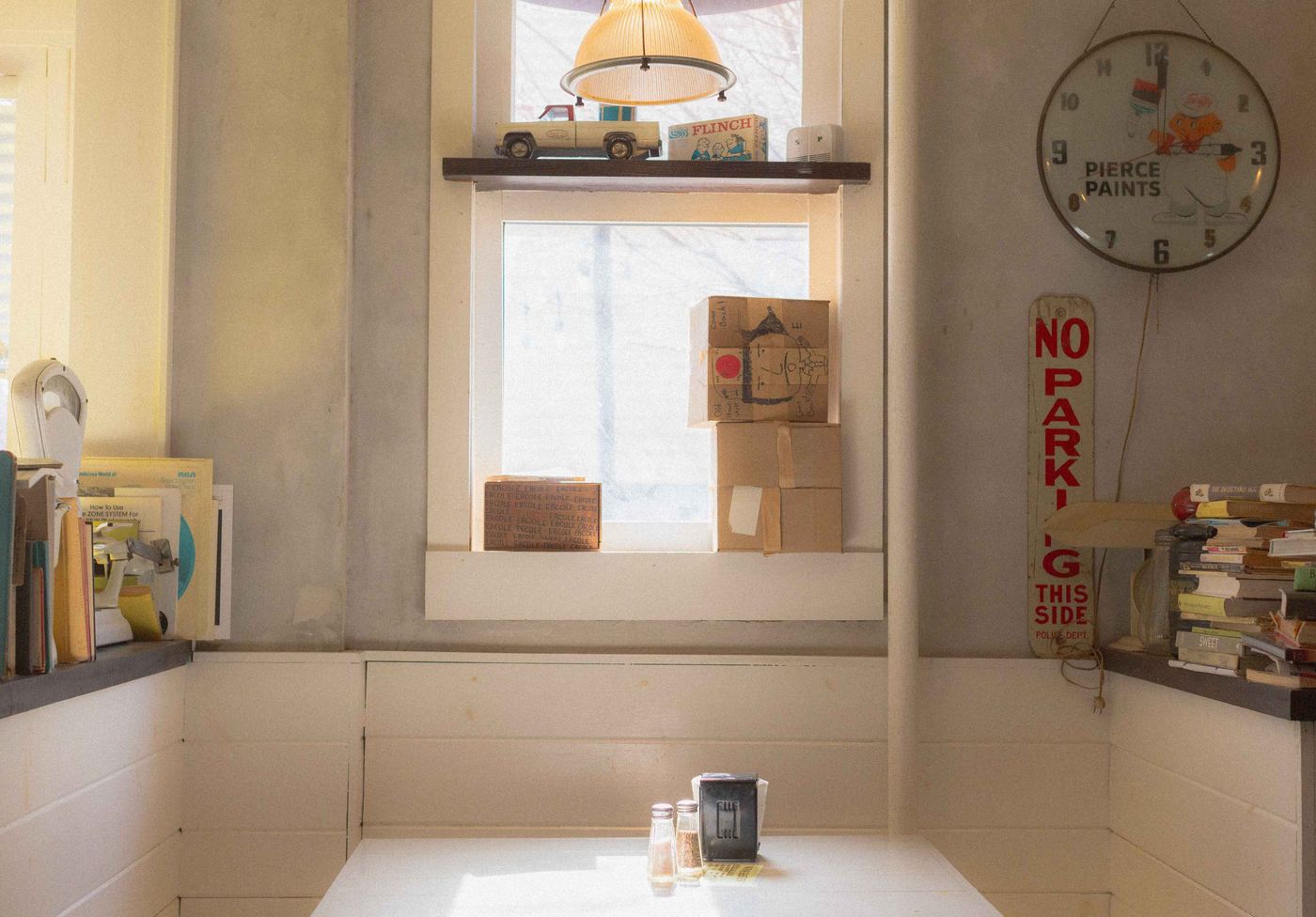
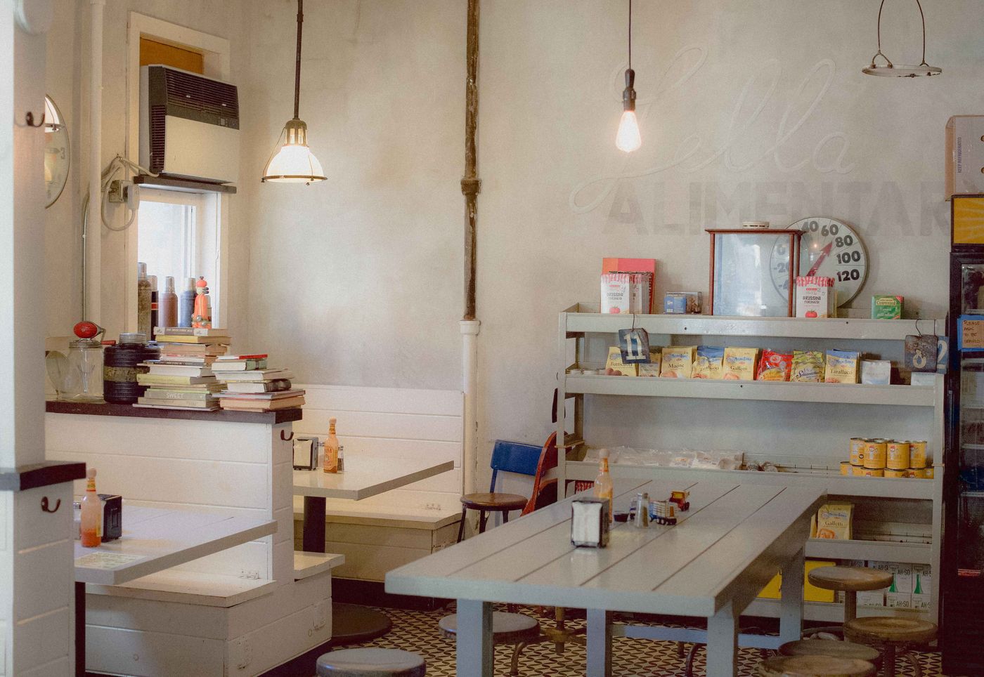
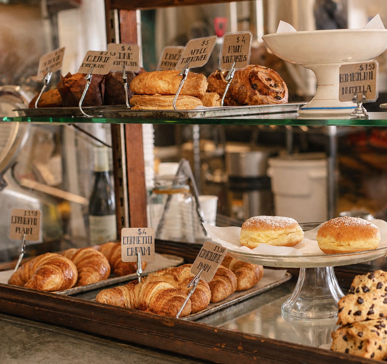
To bring Lella Alimentari's brand to life online, I captured the cafe's interior, food, and small details — the same warmth and charm that made Lella Alimentari feel like home to me when I first discovered it.
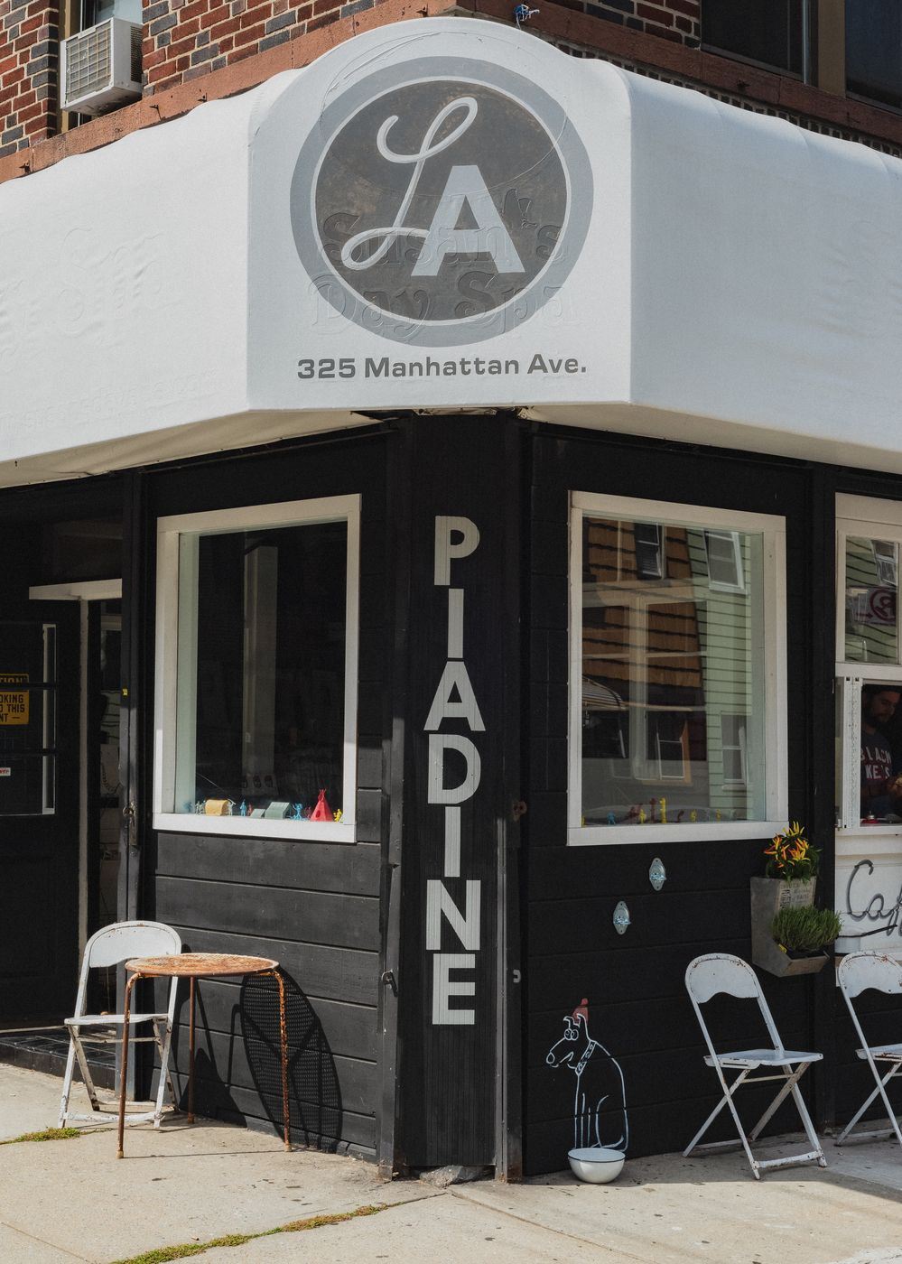
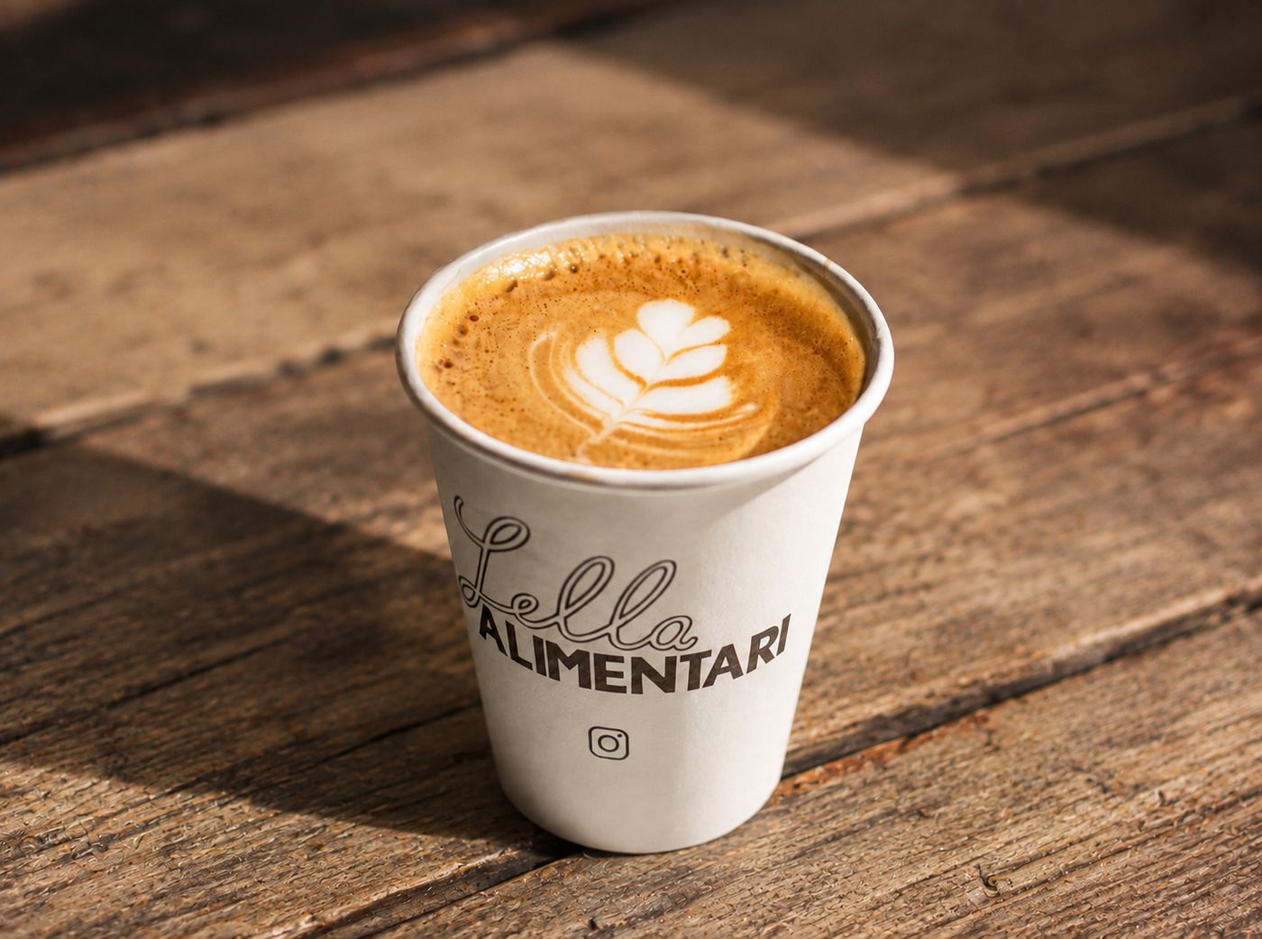
I ran five usability tests on my initial website designs to watch real people navigate the website and to note every hesitation, backtrack, or moment of confusion.
The overall feedback was reassuring:
"It's aesthetically very pleasing. All the pictures and colors go well together and it's very easy to use."
"The tasks were all easy, user-friendly, and intuitive to complete."
"It was very intuitive and easy! Felt like I was on a professional and well-developed platform."
In general, all the testers found my website design very easy to use. However, the most common point of confusion came from the navigation bar, where multiple testers gave suggestions on how to enhance clarity.
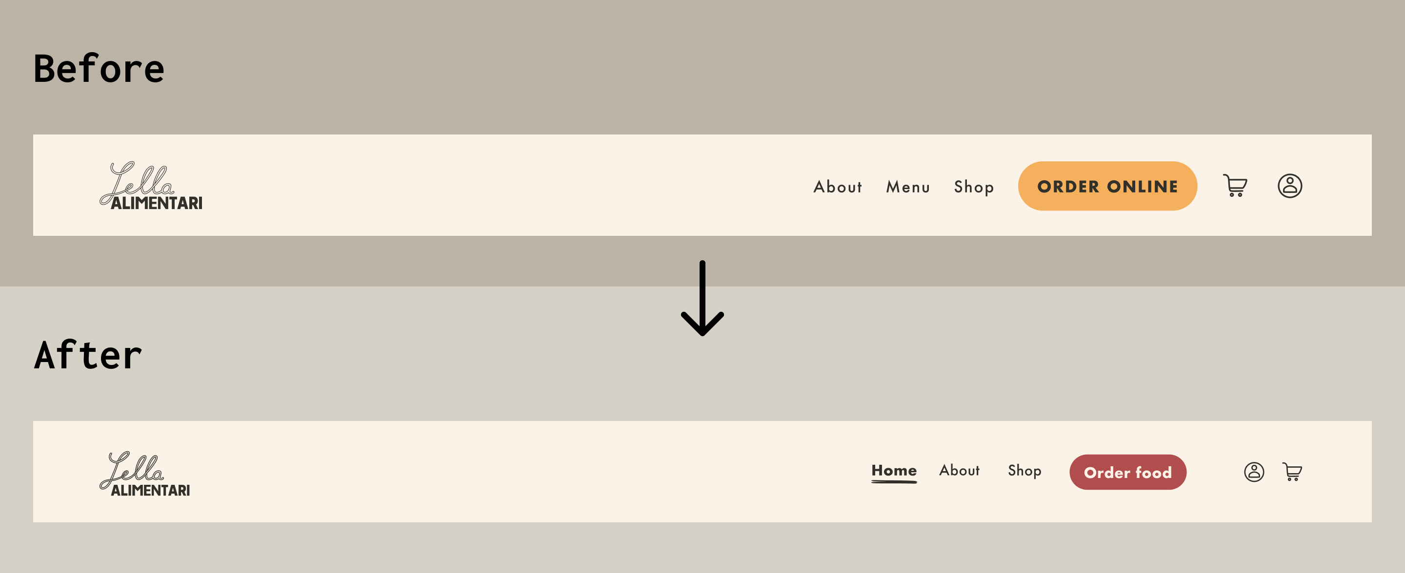
Testers indicated that a clickable logo isn’t yet a universally understood pattern and Lella Alimentari’s audience skews toward people who love Italian coffee and snacks, not necesarily tech-savvy people. Multiple users got stuck trying to find their way back to the Home page.
“Momentarily, I didn’t know how to go back to Home. Clicking on the logo didn’t come into my mind instinctively.”
Fix: The logo and a dedicated “Home” link both point back to the homepage. A little redundancy here removes doubt instead of adding confusion.
I initially intended for “Order online” and “Shop” to direct users to ordering food and browsing merch, respectively. However, many testers expected “Order online” to cover both food and merchandise.
“I thought I could order both food and merch at the same place.”
Fix: I reworded “Order online” to “Order food” to make the separation between food & beverage order and merch order more obvious. For a simpler nav bar, the menu items can be viewed in the "Order food" webpage.
Addressing these moments of friction in the navigation bar led to a clearer, more confident final design.
The following user flows follow a website visitor from initial curiosity to a finished order: navigating through the different webpages and learning about Lella Alimentari's story, browsing the collectibles (merch), and ordering food and beverages with a loyalty sign-up option that never blocks checkout. Each user flow addresses user desires brought up during the initial user interviews and resolves moments of friction that surfaced during the usability tests.
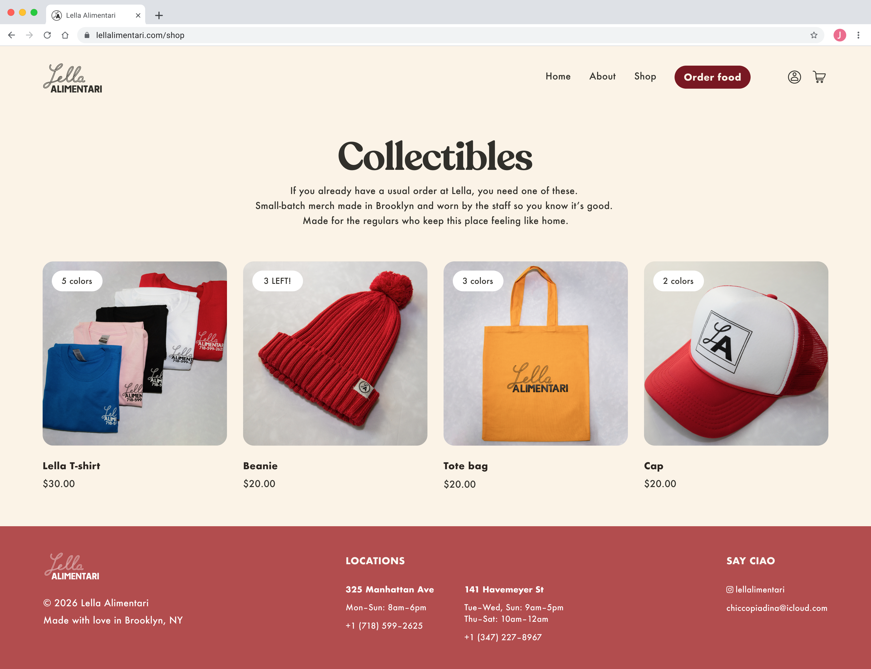
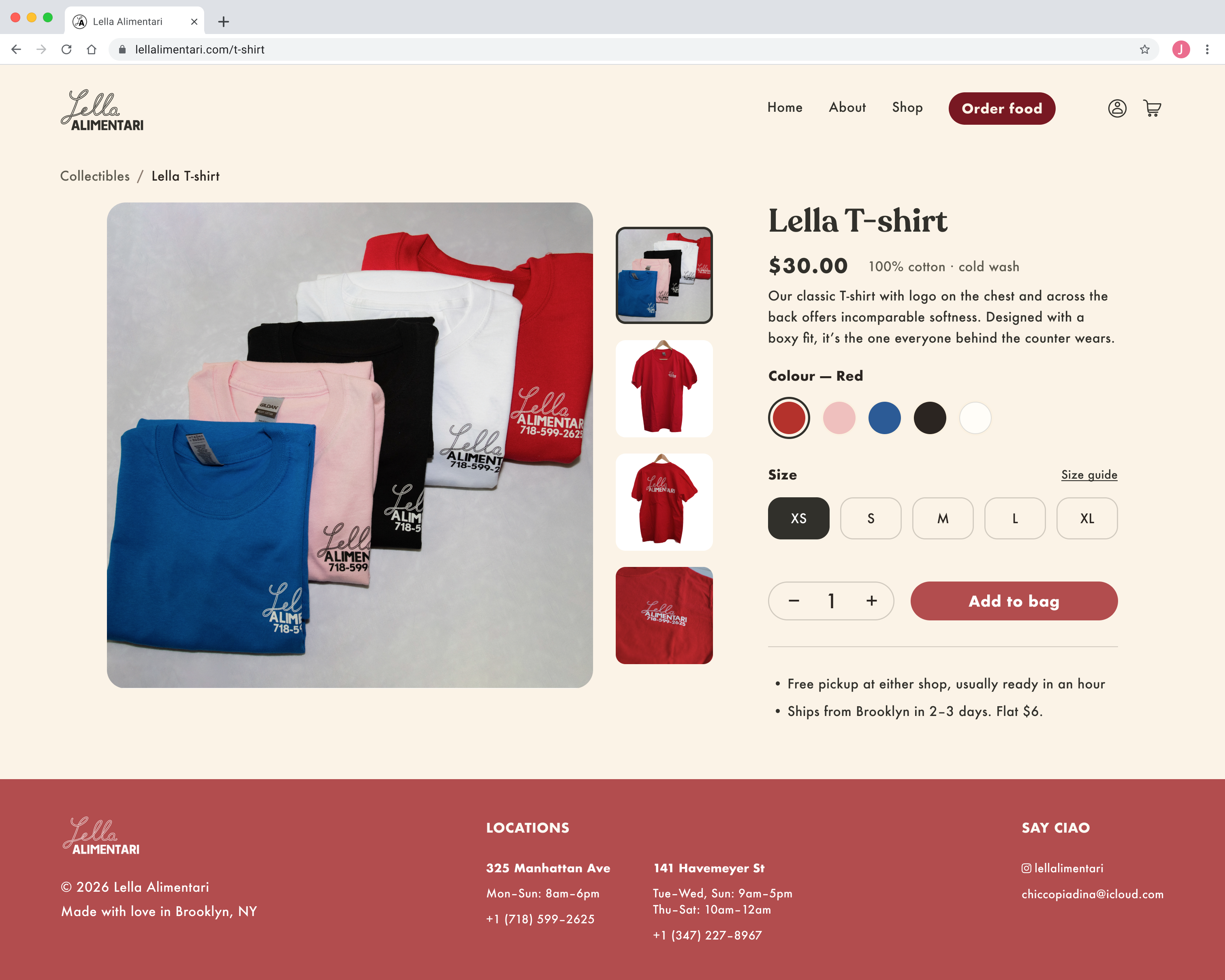
I designed Lella Alimentari's online shop to cater to customers who are looking to add adorable and usable accesories to their collection. Merch only earns its place if buying feels like belonging to a community rather than just shopping. That's why I framed the shop as "Collectibles" – to convey that Lella Alimentari's shop items are high-quality, small-batch, and worn by the staff themselves.
I mapped out every screen a customer sees when buying a piece of Lella merch, from browsing the collectibles page to reaching a confirmed order, to make sure each step felt as simple and thoughtful as picking up an item in-store.
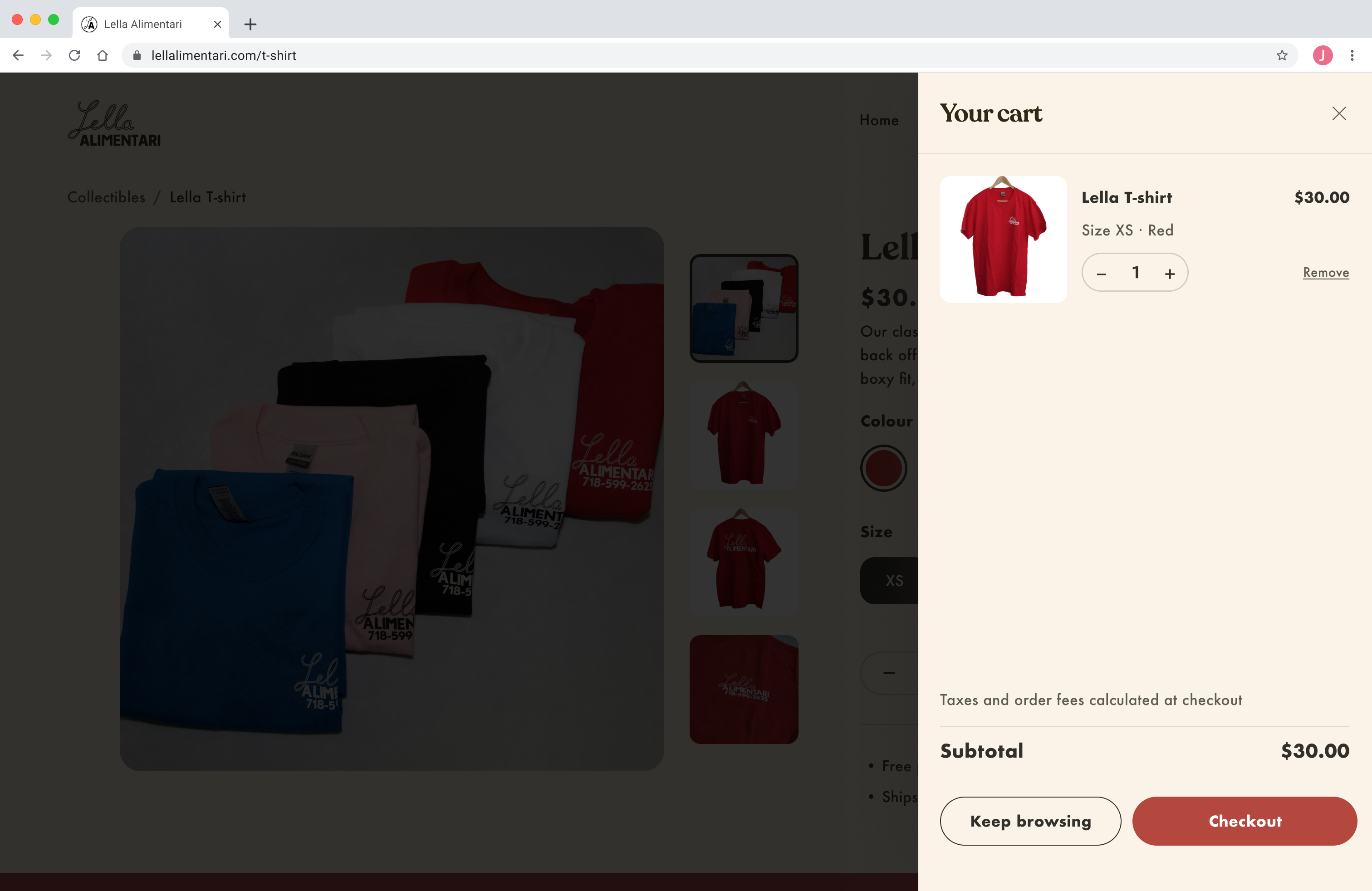
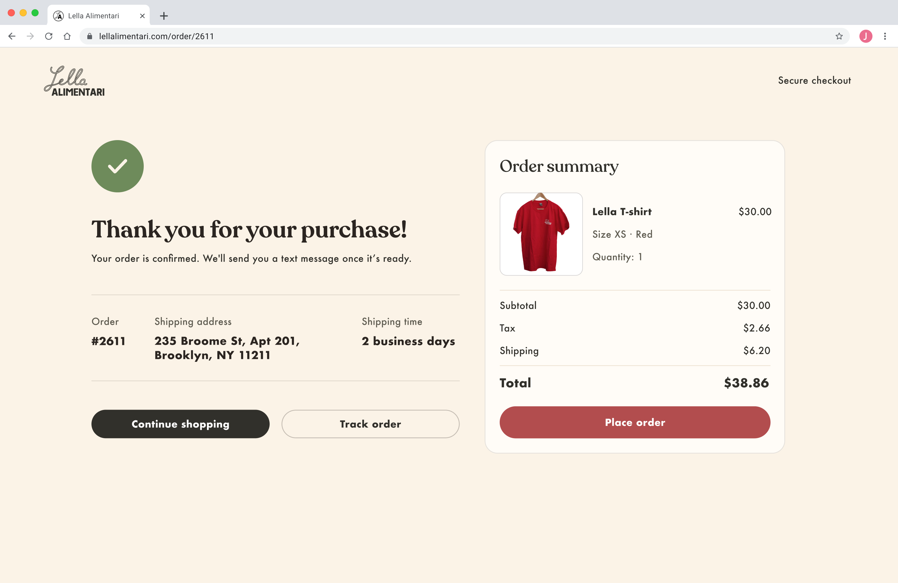
Knowing that forced account creation before checkout is a common friction point in e-commerce UX, I designed the default checkout to be guest checkout, with signing in framed as a value-add, not a requirement. This method directly addresses the needs of the two personas that I identified earlier in my user research: a first-time customer who values a quick checkout and a regular customer who benefits from a digital loyalty program.
By default, customers complete a quick and simple checkout process for food & beverage orders using guest checkout. They will see a banner that prompts them to sign in if they want to earn points on the order.
A similar banner appears on the Order Confirmed page as a gentle nudge to encourage customers to join Lella Alimentari's digital loyalty program for future perks.
%20%E2%80%93%20Pickup%20method.png)
%20%E2%80%93%20Order%20confirmed%20(pickup).png)
If the customer wants to earn reward points on their orders, they can choose to sign in or sign up. As a signed-in customer, they see their order counting towards a digital punch card. After reaching a certain number of orders, they earn a gift.
%20pt%201.png)
%20pt%202.png)
%20pt%204.png)
Both Guest Checkout and Signed-in, earning points Checkout let a first-time customer and a regular customer complete their purchases with zero friction while still giving Lella Alimentari’s digital loyalty program a real place in the user flow.
Throughout this project, I actively communicated with users and learned how to create designs that met the needs of both the business owner and customers. The loyalty program was the most requested feature in every interview I ran, and right now it lives as a single sign-in prompt at checkout. It was through conducting many user interviews that I discovered ways to solve customer pain points while helping them achieve their goals – seamlessly place orders online.
Chicco saw the prototype and was very excited. For a shop whose reputation travels almost entirely by word of mouth, finally having a website that shares Lella Alimentari's story and makes online ordering much easier demonstrates a big step in the cafe's future. Chicco has a lot on his plate at the moment, so this redesign is a proposal rather than an official launch but it's ready when he is. The design system, the photography, and all user flows are documented and handed over.